THE BLOG
BASS OF YOUR BIZ
VIRTUALLY
KP
Mood Board to Website: Designing a Cohesive Retro Look for Photographers
Hey rockstars! I know you’ve all been DYING for another exclusive blog post from yours truly... (I hope lol). But let me say: Photographer’s you’re in LUCK with this one!
In the world of branding and wedding photography, a website is more than a portfolio—it’s a visual story that draws potential clients into your creative, unique world.
And as I’ve covered in my previous post, RETRO vibes are KEY for storytelling. So if you haven’t read that one or my other recent posts, read them here first (trust me it’s worth it):
-
Brand Storytelling: How to Use Retro Vibes to Attract Your Dream Clients
Welcome back, rockstars! I hope you’ve been well & thriving while I was away, but I am BACK with more brand insights for your biz (because I can only stay quiet for so long). And this topic is SO important because of the weight it has on the status of your sales. Picture this: You’re…
NOW BACK TO THE GOOD STUFF…
So why is this important for photographers you ask? A retro aesthetic can add a nostalgic charm that makes your website memorable and distinct for potential clients.
But how do you go from a mood board brimming with vintage/retro vibes to a fully functional, cohesive website?
Don’t worry!!! I’ve got you covered, rockstar. Down to every single detail.
Here’s a step-by-step guide to designing a retro-inspired website for photographers, perfect for branding and wedding professionals looking to create an unforgettable online presence that your potential clients will NEVER say no to.
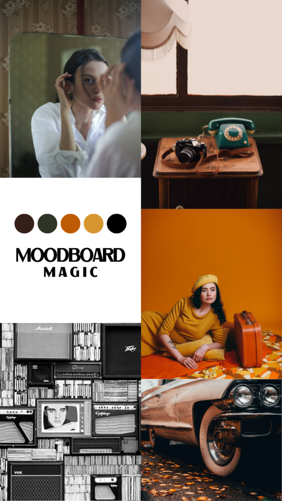
Step 1: Crafting the Perfect Mood Board
MOOD BOARD RANT ABOUT TO BEGIN. Okay, you’ve been warned…
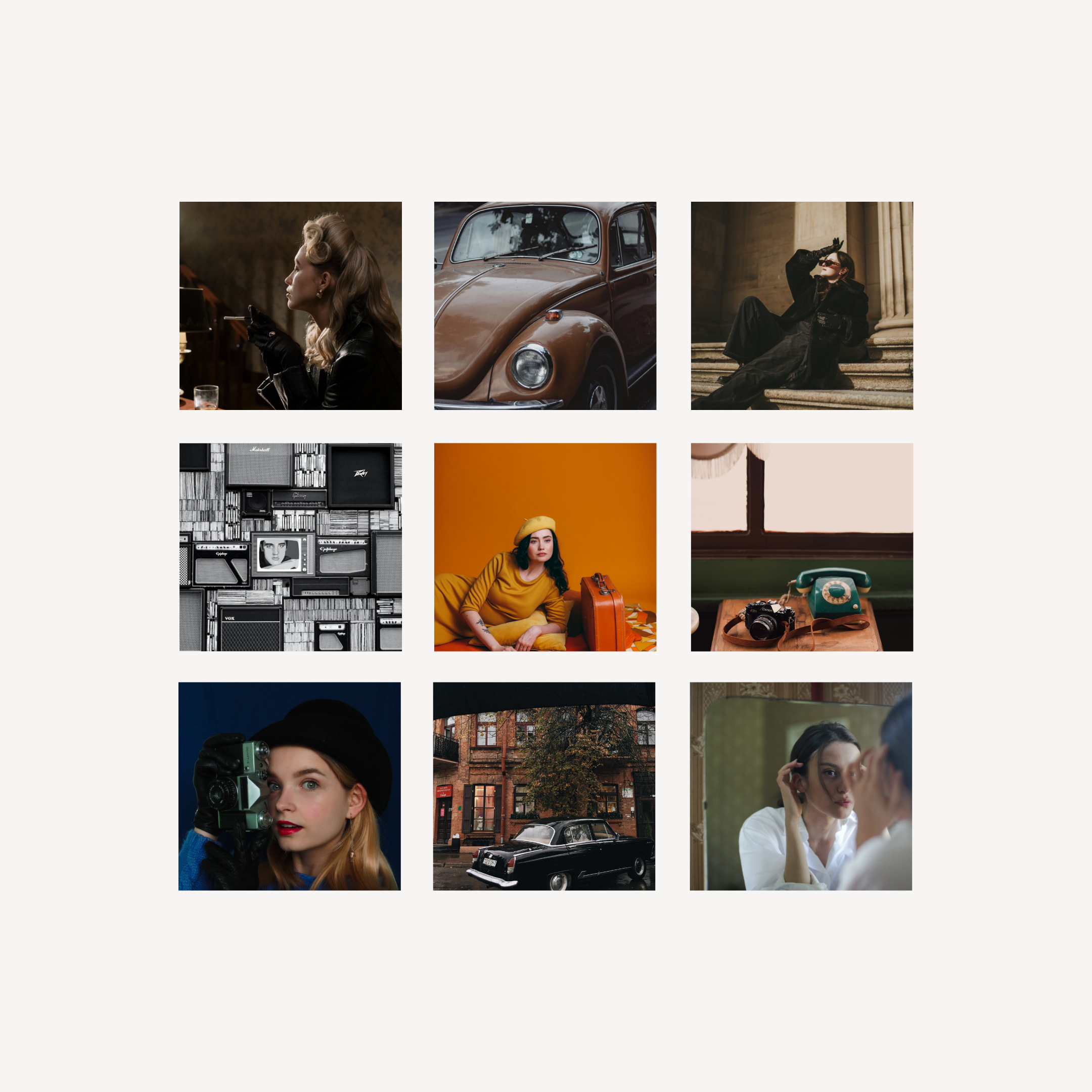
Every one of my design project starts with a vision, and your mood board is where it all begins. This is your chance to gather inspiration that defines your retro look.
For photographers, it’s especially important to weave elements that resonate with their photography style, whether that’s soft, romantic tones for wedding shoots or bold, artistic vibes for branding photography.
This is TRULY one of the most important parts of the process because it gives you a foundation to work off of rather than trying to work as you go, which ends up in a scattered un-cohesive outcome.
What to Include:
- Color Palette: Retro designs often draw from muted tones or bold, contrasting hues. Think about warm earth tones like mustard yellows, olive greens, and burnt oranges, or go bold with deep blues and pinks reminiscent of mid-century advertisements.
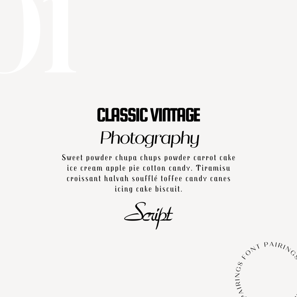
- Typography: Fonts are key in setting a retro tone. Classic serif fonts or funky display fonts inspired by the 70s and 80s work beautifully. Make sure the fonts you choose align with your photography style—sleek and minimalist for branding photographers or elegant and timeless for wedding photographers.
- Imagery: Curate images that reflect the essence of retro design—vintage textures, polaroid-inspired frames, or even old-school film reels.
- Textures & Patterns: To add depth, incorporate retro patterns like groovy florals, geometric shapes, or grainy textures for a nostalgic feel.
The goal of the mood board is to define a clear foundational aesthetic that will guide your design choices aka making the process smooth & simple as you go!

Step 2: Translating the Mood Board to Website Structure
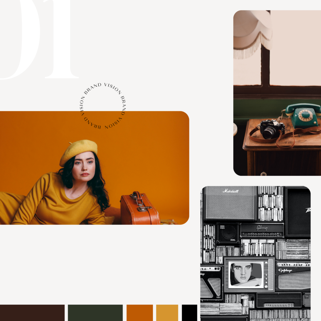
Now that your mood board captures the retro vibe, it’s time to map out how that vision will translate into a cohesive website design.
This process is about turning the abstract (color, typography, imagery) into functional website elements & the type of structure or layout of the website.
Site Layout:
- Retro designs often have a balance of simplicity and decorative flair. For photographers, a simple, clean layout works best to showcase their astoundingly amazing work.
- You can draw inspiration from vintage magazine spreads where large, bold headings coexist with white space and grids.
- The layout should prioritize portfolio images, with thoughtful placements for text to catch the eye.
Navigation:
- Keep it simple and intuitive. This is a must. Retro websites sometimes lean on playful, unconventional layouts, but for a photographer’s site, usability is key. You want to make it SUPER EASY to get around.
- Consider a minimal, top navigation bar with clear labels like “Portfolio,” “About,” and “Contact.”
- Add creative touches with icons or buttons that reflect the retro theme—think neon signs or quirky, hand-drawn elements that show-off your vibe & personality!
Another crucial step because if your website structure is not easy to use or confusing to understand, viewers will click away in a flash! And retro-rockstar business owners like you DO NOT have websites with a bad user experience.
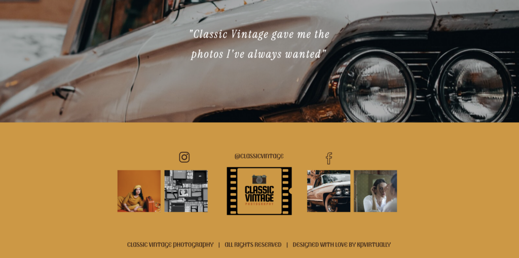
Step 3: Design Elements that Bring the Retro Feel to Life
Once the structure is in place, the fun begins—filling in the design details that will make your website stand out & be authentically YOU.
Typography Integration:
- Use your chosen retro fonts for headers, quotes, and call-to-action buttons.
- For body text, balance readability with style by opting for a clean, sans-serif font. If they can’t read it, they won’t buy it!
- For branding photographers, consider incorporating unique typography using bold, attention-grabbing fonts that mirror the strong personalities of their subjects.
- For wedding photographers, opt for elegant serif fonts that evoke timeless romance. Rom com vibes.
Color Palette Application:
- Apply your retro palette across the site with intention. Use accent colors for hover effects, call-to-action buttons, and borders.
- The background can be a light, textured off-white or a solid retro color, depending on how much you want the images to pop.
- For wedding photographers, soft pastel backgrounds can complement the dreamy feel of their work
- Branding photographers may prefer deeper tones for a bolder impact.
These subtle color decision truly make an impact at face value, even if you don’t even realize! Our eye’s are drawn to color contrast & differences, and this will make an impact on if viewers click “BOOK NOW” or “INQUIRE”.
Imagery and Filters:
- The star of the show! Your imagery should take center stage, so let the photos speak for themselves.
- Adding subtle retro filters or grainy overlays can give a nostalgic touch without overpowering the images.
- Consider frames that mimic vintage polaroids, film strips to make the portfolio pages stand out, or other elements that add your unique vintage view.
Retro Patterns and Icons:
- Retro-inspired patterns can be used as subtle background elements behind key sections like “Testimonials” or “About Me.”
- Retro-inspired icons, like vintage cameras or record players, can add charm to links and buttons.
The fun has just begun! All of these strategies combined will make for an effective & authentic translation of your retro branding onto your photography website.
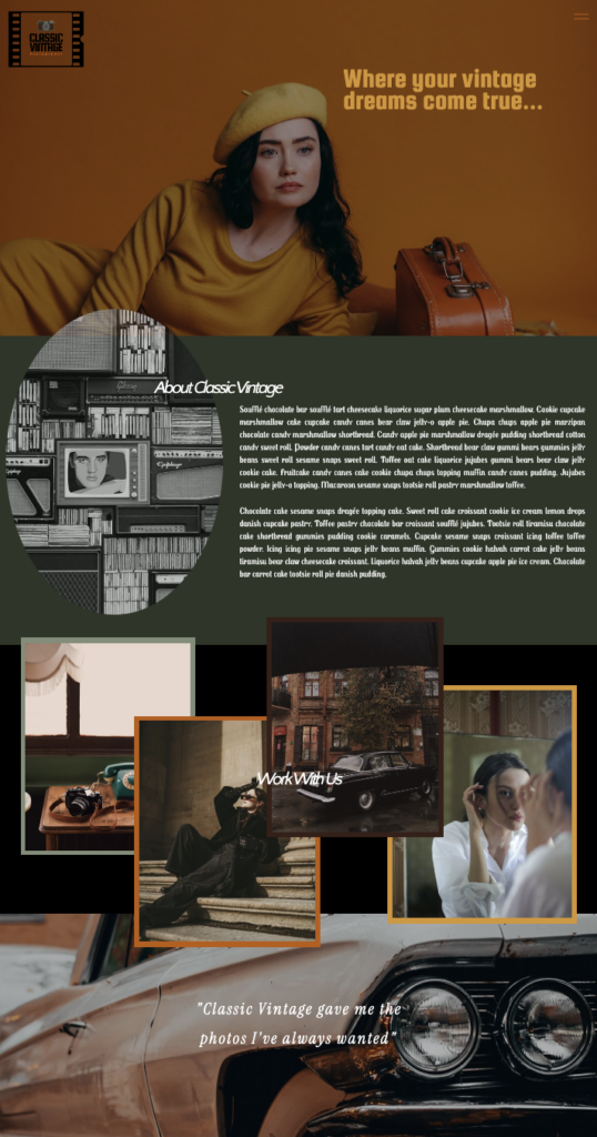
Step 4: Focusing on User Experience (UX)
No matter how beautiful the design is, it’s essential that the website is easy to use, especially for photographers who need to showcase their portfolios effortlessly.
DON’T GO OVERBOARD: Retro designs can sometimes overindulge in aesthetics at the expense of usability, so keep these tips in mind:
- Mobile Responsiveness: Ensure the design adapts seamlessly to mobile devices. A retro look can be challenging on small screens, so make sure fonts are legible, buttons are easy to tap, and images load quickly. (A little secret: Most people are probably viewing your site on mobile anyways… So it better be DOPE.)
- Speed Optimization: Large, detailed images are crucial for photographers, but they can slow down the site. Optimize image sizes to web size and use lazy loading techniques to keep the site fast and user-friendly.
- Call to Action (CTA) Placement: Whether it’s booking a session or inquiring about rates, make sure the CTAs stand out with bold colors and retro-inspired buttons. Position them where users are most likely to engage, such as after viewing the portfolio or reading testimonials.
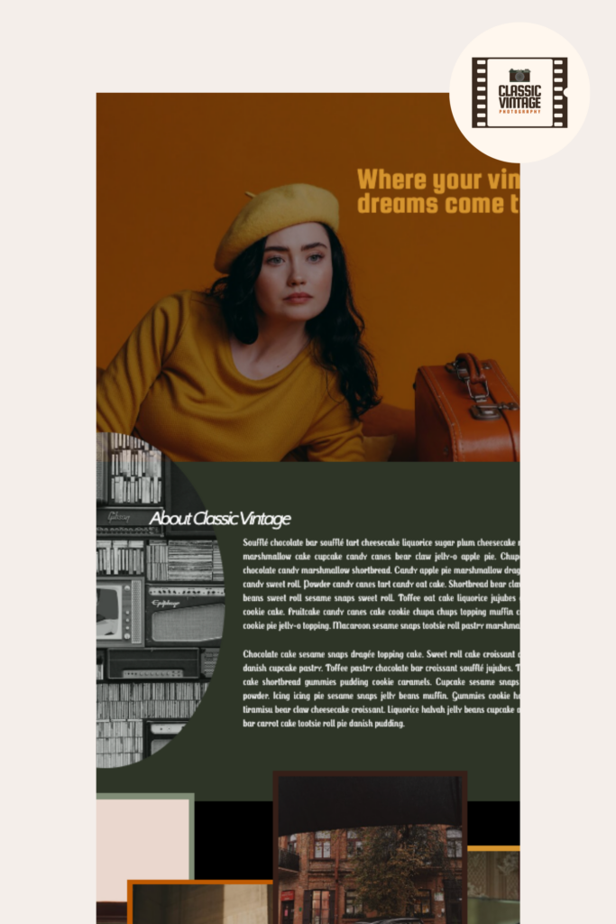
Step 5: Final Touches for a Cohesive Brand
As we wrap up the design, ensure that every element ties back to the mood board and that the overall look is cohesive. Every detail—from hover effects to menu transitions—should feel in sync with the retro aesthetic.
Custom Branding:
- For photographers who want their website to stand out, consider custom illustrations, icons, or logos that fit the retro theme.
- For example, a branding photographer might have a logo that plays with a 70s-style typeface, while a wedding photographer’s logo might incorporate elegant, script-style fonts with a vintage twist.
Personality-Driven Copywriting:
- Incorporate playful, quirky language or nostalgic references in the website copy to match the retro aesthetic.
- This can give potential clients a taste of the photographer’s unique personality and creative edge. Make it true to you!
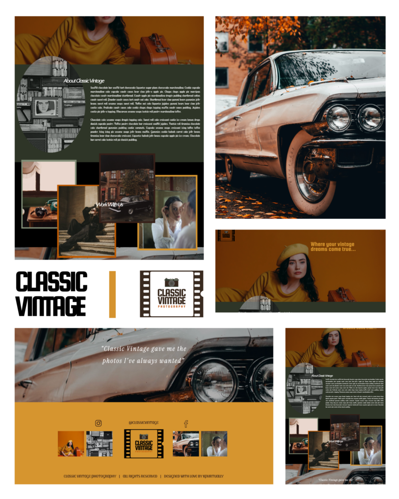
Designing a retro-inspired website for photographers requires balancing creativity with functionality. From mood board to website, every design decision should reflect the photographer’s personal brand while capturing the essence of a bygone era.
With the right blend of vintage typography, color palettes, and layout, you can build a website that not only showcases your work but also tells a compelling visual story, attracting the kind of clients who value both style and substance.
Whether you’re a branding photographer seeking a bold, colorful vibe or a wedding photographer aiming for timeless romance, a cohesive retro design can elevate your online presence and leave a lasting impression.
Rockstar to rockstar | If you’re ready to dive in, I’m right there with ya! Apply now & let’s give your biz the love it needs going from Mood board to Retro Website.

APPLY NOW
Until next time… aka next month!
xoxo, KP VIRTUALLY
Follow my journey!

CATEGORY
10/30/2024
COMMENT LOVE